
From a reader on the east coast of England who has just recently moved there from points much closer to the equator (India or Pakistan -- I'm not sure): how much of the history which appears in THE DECEIVERS is real? For example, in the book, do I give a real, genuine, accurate portrayal of Scarborough and Whitby in 1862?
 Yes. Absolutely. I researched the period and the locations to death, and wove the information into the novel so that, though you're not reading a text book, you are certainly reading a 100% credible depiction of the era and place. So, if you're looking for background on Scarborough and Whitby, you could do a lot worse than read THE DECEIVERS ... with this single disclaimer: it's a gay novel! Duh. Be sure your dear Auntie Flo will enjoy the frank exploration of a romantic entanglement between two beautiful young men, before you hand her this book as a research work for her project. Auntie Flo could easily surprise the heck out of you and say, "Oh, my dear, I've read it many times, it's one of my favorite Keegans!"
Uh, yeah.
Next question, from the same reader: why did we change the cover on the book?
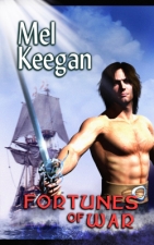
 We've been leaning toward wraparound covers lately -- covers where the artwork carries right on around to the back, with the text (blurb) overlaid. The cover to the first edition was beautiful, but it's definitely a vignette. Doesn't lend itself to a wraparound. The new artwork was done specifically to fit, using a seascape which was captured offshore here (Brighton or maybe Noarlunga; I forget), and a schooner which was borrowed from a small, nasty, grainy old photo, and completely repainted. The faces from the original cover were saved, and dovetailed into the back cover.
 The original cover looked like this, and you see what I mean. It's a vignette, pure and simple. The whole design doesn't lend itself to a wraparound, whereas, if you've been keeping an eye on the new editions, you'll have noticed that many of them are in the new design.
Speaking of book cover designs --
We're thinking of a new (2009) edition for the NARC covers. It's still in the suggestion phase, but a new 2009 edition is out there...
The cover for THE LORDS OF HARBENDANE has been designed but not yet painted. It's going to be an absolute beauty. I'm loving it even as a design sketch. You'll see the HARBENDANE cover here, on the blog, much earlier than it'll appear on the website.
And yes, when the HELLGATE series is complete next year, new covers will be designed for the hardcovers -- we'll be combining the six books into three big hardbacks, and the project deserved new jacketing. You'll also be able to get them as six paperbacks, of course; and you'll be able to get either six individual ebooks, or a "Pack" of all six in the same zip archive.
Next reader's question (probably the last item for today) is photographic. This, from a nice gent in Toronto: do you recommend Micrografx, because I'm looking for an alternative to Photoshop, which is way beyond my budget. (I talked about using this software to cure the scanner measles on the Alaska pics uploaded a couple of posts ago, so this is a very astute question. See? People do actually read this stuff.)
 Oh, yes. I've always used Micrografx Picture Publisher for retouching photos -- right back as far as 1995. I've used Photoshop, but the few features it has over Picture Publisher 7 don't warrant the incredible pricetag. PP7 will do 80% of anything Photoshop will do for you ... in an interface which is so simple and friendly, a chimpanzee could figure it out ... and the pricetag is (!) about $10 on Amazon right now. Highly recommended, and then some. For a start, look at the difference in price; and I promise you, PP7 will give you the vast majority of all you'll get out of Photoshop, and an interface you can actually comprehend, and a learning curve you can scramble up in a week or so.
One word of warning: I have no real idea how it performs under Vista. I still use XP pro, and have no plans to change, because what I've seen of Vista looks pretty bad. Under anything from 2000 and ME right through to XP, you don't have a worry with PP7, but Vista could cause all kinds of nasties. perfectly good programs fall apart under Vista. So ... keep your fingers crossed, or ask around before you buy. Can't help you here: I'm not touching Vista with the proverbial 10-foot pole.
 Re: this program, I can also give you the 100% recommendation from our cover artist, Jade, who uses the same software for very different purposes. Keegan might been retouching photos, like the scans of my old Alaska prints, which predate digital photography, but Jade uses the painting tools in PP7 to actually PAINT. Proof of this particular pudding? THE SWORDSMAN cover was painted in Micrografx -- from scratch, I might add ... from sketches.
Incidentally, Picture Publisher 8 is out ... for about $150. You probably don't need it. You'd have to be a top-line pro, the Syd Mead of your neck of the woods, to want this. It *is* the font runner, right along with Photoshop (and again, far easier to use), but why pay $150 for version 8, when 7 will do, for less than ten dollars at Amazon?
That's all I have time for today, questions-wise. There's a couple more to answer, and you have my promise, I'll get to them soon. This week. Seriously. But right now, I have these two guys waiting for me in a fantasy realm called Harbendane ... where the fair city of Althea is girding its loins for war, and the barbarians are gathering in the north, and there's a hot gay romp happening on silk sheets, so --
'Scuse me, while I get some work done. (Ha! Work, they call it...)
Cheers,
MK


No comments:
Post a Comment