The special offer is this: they waive the US$40 per book upgrade fee, which you pay in order to bump your book from the "regular" account to the "pro" or "gold" account. When a book is upgraded, you get to keep an extra wedge of the sale price, and US$40 / A$65 is a good deal -- if you're only doing one book. Try it again, when you're potentially doing 20!
So CreateSpace (probably in the interests of drumming up some trade) has had this special deal running for the last few months: upgrade your book(s) by December 21st, and they waive the fee. We're in the process of doing #7 at this point (The Deceivers). The next titles "going up" are Dangerous Moonlight, The Lords of Harbendane, and the NARC series. That's 14 out of the range of 21 novels on my backlist at this time (the short fiction doesn't appear on the list). Two thirds. Good enough.
The process is easy enough, though time consuming -- a tad bit expensive, too; because before you can give your book a "nudge" in the direction of Amazon, you have to buy and approve a proof. Which costs A$45. But this is okay too -- it's well worth the investment. (It would be geting pretty darned expensive to pay the $65 upgrade + the $45 proof for each of 21 books. Over two grand to set up this list. Hmmm.)
The challenge is in repackaging some of the titles, to make it a little bit more obvious that these are gay books, featuring a m/m relationship ... and it's not so easy as it sounds. What the hell is a gay book anyway?! They're hard to categorize. Do gay characters make a book gay? Or does it have to be gay people doing day things? And what's a gay book cover?
It's simple to put a cover on a work of erotica ... they speak for themselves. But with gay book covers you're walking a tightrope. You don't want to put an erotic book cover on a book that's far from erotica. At the same time, you do want to indicate that it's a m/m gay book.
Which leads to a lot of head scratching. Yesterday's post showed the new cover we just slapped on Storm Tide: http://mel-keegan.blogspot.com/2008/12/storm-tide-on-road-to-amazon.html; and here was the new Aquamarine cover: http://mel-keegan.blogspot.com/2008/08/book-launch-aquamarine.html ...
And here's the new cover on The Deceivers -- previewed online for the first time:

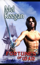
The graphical theory is this: the fact that it's two male faces juxtaposed ought to be enough to tip off modern readers to the fact this will be the relationship driving the book; the cover features faces, not nekkid or semi-nekkid bodies, so people are given a clue as to the fact it ain't "only" erotica; and the background subject matter puts the m/m relationship in context. It looks like it works. I like this cut of the cover a great deal. The characters were colorized (actually, it's sepia -- which suits the treatment perfectly, since sepia was state of the art in photography in the second half of the nineteenth century), and we have a different "take" on the original cover of the book, which was this one, at our left, and/or just above, glued to this paragraph with code. I always chafed at the fact we were not able to have a schooner on the original cover (technical reasons made the square rigger unavoidable in the original design). This was fixed by changing to a whole new cover for the Lulu edition ... which put the faces on the back, in blue -- which was fine, because we were retailing the book off my webpages, so readers knew exactly what they getting.
But Amazon is a little different. They only show the front cover, and they give VERY little background info on the book the reader has pulled up almost accidentally as a sidebar on some search. Without some visual clue, however trifling, to the fact this is a gay book, a reader could be of the understanding that they're buying an, er, sraight historical sea story. Baaaaad idea.
So -- all this gives us the opportunity to take another crack at the cover, and combine all the elements again: the sea, the sky, the ship (and it's a schooner this time, too), and the faces.
To my eyeballs, it's a resounding success. Next challenge: what the hell is going on the cover of Dangerous Moonlight?! The NARC books are well known enough for them to 'fly" as they are, but DM needs some kind of a visual cue for readers. And inspiration has to start biting in the next five days, max. Ouch.
Stay tuned!
Cheers,
MK


No comments:
Post a Comment